The post office is sitting in the downtown Baton Rouge where most attractions of Baton Rouge for visitors and residents are. So my original thought was to create a space not only a transit center, but also a place which play the function of information, entertainment and service into one role.

My design began with the concept that new building go through the old post office and connect parking lot, transit center, entertainments space and public park.

For the project, a column and beam structure was chosen. This allowed for a stronger support system for the elevated park area and program. For the system, a 40’ x 40’ structural grid was created. To compensate for a large singular column, a 10’ buffer zone was created to allow for smaller columns to be set in place. This logic allowed for a seemingly random pattern, and set up an interesting visual effect. Also, the columns act as signage for the different bus systems. The columns taper before meeting the ceiling allowing light to pass below. Different colored glass is set in place to designate bus lanes. Finally, the columns act as circulation paths for the park space above. People constantly weave in and out of the columns and are always interacting with them.

The concept for this design was to have a “blanket” draped over the site to connect all of the pieces of the massive program. A blanket would create many folds, which could be used to organize program and direct people throughout the site. As the idea developed the“blanket” became a “ribbon” to literally “tie” all of the pieces of program together. The ribbon is made of fritted glass and creates spaces and experieces by folding, splitting apart, and breaking through part of buildings. The circulation of the site is linear and provides an entrance into downtown Baton Rouge from a supposed greenway that runs underneath the interstate. The post office building is cut through to create a boulevard with retail, businesses, restaurants. The ribbon runs along this linear path and provides a skylight for the boulevard. It also forms the roof of the restaurant for an interesting visual experience. The ribbon leads to the the bus and taxi bays at the other end of the site.

Unfortunately my diagrams did not help me to determine spatial relationships. However, they were useful in determining my overall goal for the project, which was to use the trusses from the Wheatly School to sort of grab the incoming greenway users and pull them into the program and transit station, as well as push the transit users out towards the program and greenway, unifying not only the composition, but the types of people illustrated my diagrams.  Another concept shown in the model is the thought of having the pieces of program “step down” from I-110.

1/128 Scale Model

Section Detail

My approach to this project began with creating a series of diagrams illustrating spatial relations between program at different times of day (which can be seen here https://htdesignresearch.wordpress.com/2010/04/27/time-space-program-diagram-3/).  This information revealed that during the day the station would mostly be used for transit or work related events, and at night for more entertainment purposes.  With this in mind I designated the first floor for public concourse to where people can move freely from one place to the other, and the second floor for entertainment and relaxation to where someone may stay for longer periods of time.  The exterior space on the second floor is covered by an open canopy supported by the Wheatley trusses, which provides shade but allows for the space to remain exterior.  Each floor is easily accessible by either the parking garage, entrance ramp, or two story spaces.

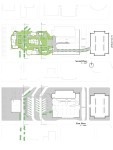
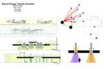
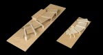
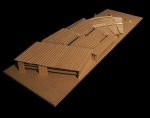
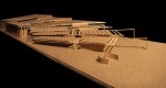
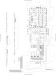
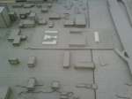
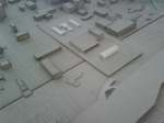
Our project began when with a visit to the site, where we decided that we needed to make an entrance in Baton Rouge and bring life back into the site. To do so, we used to concept of raising the green space above the concrete already on the site. The design is one with two large ramps that lead you up to the main area of program, located on top of the back of the post office. The ramps both provide shade below for program, such as the bus waiting area or the rental car parking, and acts as the part of the public concourse that both leads to the main public concourse and to the roof, where a concrete park and stage area is set. The ramps seem to peel off of the ground, which also creates exclusive areas below the ramps, like the exhibits area below the interstate entrance, and the trolley stop. The pavilion in our design solves multiple purposes. It cuts completely through the roof, concourse floor, and into the bottom of the post office, providing daylighting to all levels. It also serves to collect rainwater, provide shaded seating on the roof, and ventilate all levels of the design. The pavilion is shaped to bring focus to the main parts of the program – the restaurant, retail, BREC facility, and library.

The main focus of our project is to blur the line between the urban and natural environment. Through our concepts and diagramming processes we developed a structure that entwines and curves just as it unites and weaves the people through. Our structure sways people through the station by separating parking and bus bays with the Post Office. With all the automobiles on the ground floor we wanted to bring the people to the second floor to keep the two separated until their union was needed. This idea was the start of our ideas for construction. There are many routes through the station and there is no wrong way to go through it. This provides for multiple experiences and different perspectives. Part of our concept was to have a good amount of vegetation throughout the station. All the green makes you forget you are in the downtown area as well as provide shade, cover, and filtered sunlight.

With this project I am trying to use the existing site to create a community within the larger community of Baton Rouge. I put in basketball/tennis/soccer courts for recreation. I also put all of the program elements outside next to the post office to create a factory shop feel, which has always felt like a separate community to me. I tried to best have everything tied together some way, whether it is circulation or common relationships between the program. I wanted to make the space look to be more about the elements of the site rather than completely about automobiles so I hid the parking from the street with trees. I also put the transit station elements close to the highway to keep the noise away from the community space. I also have it close to the highway for easy access. I tried to keep the circulation in a circular pattern like convection current for a nice flow to the site.

cess. I tried to keep the circulation in a circular pattern like convection current for a nice flow to the site.

program diagram

frequency chart

The first link is a simple diagram of program.  It breaks apart the program into 3 main sections where smaller parts of the program fit into it.  The next is a chart of activity that relates to the 3 main sections of program.

From left to right:

Diagram1: a diagram showing the amount of employees at the transit station (red) vs the amount of visitors (black)

Diagram 2: the same diagram, broken up into shift times. Green are nonworking people using the transit station at undetermined times.

Diagram 3: a 24 hour timeline showing when visitors and employees would be using the transit station based off shift times.